
Work Fields - Advanced Settings
| Field | Applicable To Data Type | Description |
|---|---|---|
| Number of lines |
Text |
This property helps you to define the number of lines that the users can enter text. The text box will be enlarged based on the selected number of lines. |
| Restrict to Captial letters |
Text |
Enable this setting to capitalize the entered text automatically. |
| Validations |
Text |
It allows you to define validations on the input entered. Minimum Length: Enter the minimum number of characters that the users will be allowed to enter in the field. The users will be unable to create work if the entered characters are below the minimum value. Maximum Length: Enter the maximum number of characters that the users will be allowed to enter in the field. The users will be unable to create work if the entered characters are above the defined value. |
|
Regular Expression Validations |
Text |
This property allows you to define validation rules in the Regular Expression field. This is used to perform validation checks (format, length, etc.) on the value that the user enters in this field. If the user enters a value that does not pass these checks, it will throw the configured Error Message. |
|
Visibility Restriction on Employee Groups |
All |
This property allows you to make fields visible or invisible to the selected employee groups. You can use this option to hide certain sensitive fields. By default, the field is visible to everyone. Check out the Add Employee Group page to create an employee group. |
|
Edit Restriction on Employee Groups |
All |
This property allows you to make fields editable or uneditable to the selected employee groups. You can use this option to disable certain sensitive fields. By default, the field is editable to everyone. Check out the Add Employee Group page to create an employee group. |
|
Field Dependency Based on Values in Other Fields |
All |
This property allows you to make fields mandatory/hide/disable based on the values entered in other fields. The field will be automatically hidden/disabled/ become mandatory if the field value satisfies the defined criteria. For example, if you want to hide the Cheque Number field when the users select Payment Mode as Cash, then you need to define the criteria like below: 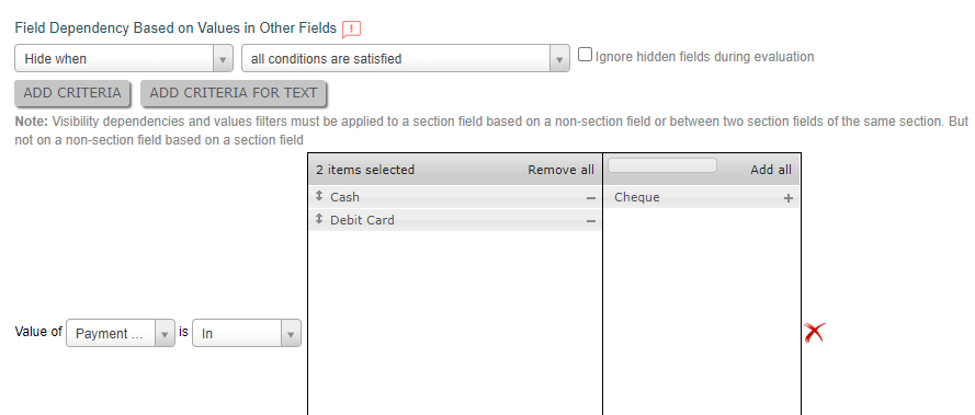 All fields will be visible when you open the form. 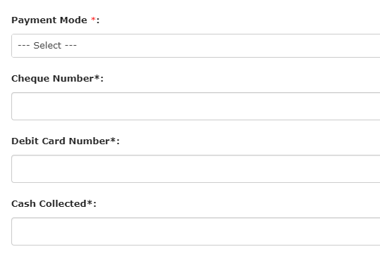 The fields related to debit card and cheque will be hidden when you select Payment Mode as Cash. 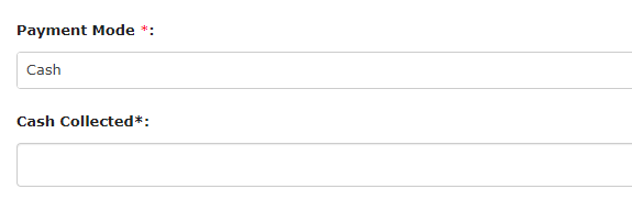 Similarly, you can make mandatory or disable fields based on values in the current/other fields. |
|
Restrict Data From Mobile |
All |
This property helps you to restrict the data flow to the server. The value entered in the field will not be sent to the server when you create work in the mobile app. |
|
Show Help Text |
All |
The Show Help Text field allows you to provide some additional information or instructions to assist the users in entering an appropriate input in the field. The below image shows how an entry in the label field looks like: 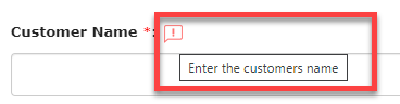 |
|
Select Font for Field Label and Field Value |
All |
This property allows you to select customized fonts and colors for Label and Value as per your requirement. You can use different fonts and colors for the field labels and the field values. The below image shows how it works when you access a work field through the Web App. 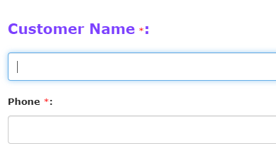 Check out the Create New Font page to create a new font as per your requirement. |
|
Gallery Restriction |
Audio, Image, Signature, Video |
The users will get access to upload a file from their device while create work through the mobile app. By default, the user doesn’t have access to upload a video from the device. |
|
Media Deletion |
Audio, Document, Image, Signature |
This property allows the users to delete the selected file when creating work through Web App. When you enable this, the users can be able to see the delete icon. |
|
Show Decimal Upto |
Currency, Number |
This property helps you to define the maximum number of digits that the users can enter in this field after the decimal point. If you choose decimal up to 4, then see below how it works when you enter an input in the field. 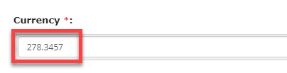 |
|
Validations |
Currency, Number, Phone |
It allows you to define validations on the input entered. Minimum Value: Enter a minimum value that the users will be allowed to enter in the field. The users will be unable to create work if the entered value is below the minimum value. Maximum Value: Enter the maximum value that the users will be allowed to enter in the field. The users will be unable to create work if the entered value is above the maximum value. |
|
Validate Based on Values in Other Fields |
Currency, Date, DateTime, Number, Time |
This property allows you to set an error/warning message based on current/other field values that are having the same data type. It will throw the configured error/warning message when the field value satisfies the configured criteria. The users can be unable to create work if you set an error message. The users can create work forcefully if you configure a warning message. |
|
Filter Based on Value in Customer Type Field |
Customer |
This property helps you to apply filters based on the Customer Type. The customers from the selected Customer Type will only appear. |
|
Setting Remainder (Works) |
DateTime | Enable this property to set reminders. The users get reminders with a label that is entered in the selected field. |
|
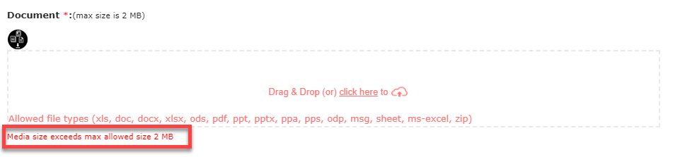
Kindly Specify Maximum Media File Size |
Document, Image |
This property allows you to define the maximum file size (in KBs/MBs) that
users can upload. The users can be unable to create work if the uploaded
file size is more than the defined size. You will get an error as shown in
the below image when the file size exceeds the defined size. |
|
Select Restriction on Employee Groups |
Employee | The users can select employees from the configured employee group only. See the below image:  As per the above configuration, the users can select only the employees in the Field Employees group. Check out the Add Employee Group page to create an employee group. |
|
Filter Based on Value in Territory Field |
Employee | This property helps you to apply filters based on the Territory. Only the employees from the selected Territory will appear. Look at the below image for a sample configuration: 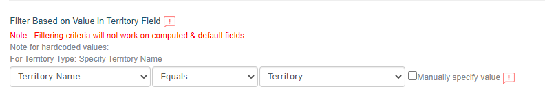 As shown in the below image, the employees in the Hyderabad territory will be available to select from the Employee dropdown. 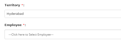 Check out the Create a Territory page to create a territory. |
|
Filter Based on Value in List Field |
Employee |
This property helps you to apply filters based on a List field used in the form. Only employees from the selected list field will appear. |
| Location Restriction | Location |
This property allows you to restrict the users to select a location on the map from other locations through the mobile app. |
|
On-demand Request For Location |
Location |
Enable this setting to send a link to the customers via email and SMS. The
link opens Google map, and the customer can select the exact location and
submit it. The lat-long values get automatically populated onto the work
location field when a customer successfully submits the location. You can
also configure the default phone number. You can see the icon highlighted in
the below image when you enable this setting.
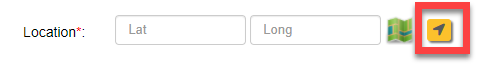 The Request for Live Location pop-up appears when you click on the icon. You have to provide email and phone number to send the link. The location coordinates get automatically populated onto the current location field when the user submits the location. |
|
Filter Based on Values in Other Fields |
Multi Pick List, Pick List | This property helps you to filter the entities/form submissions based on values in the other works fields. Look at the below image for a sample configuration: 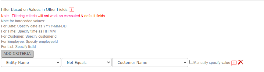 As shown in the below image, the entities other than Rohit will be available to select from the Custom Entity dropdown. This configuration works similarly for Form, Pick List, and Multi Pick List data types. 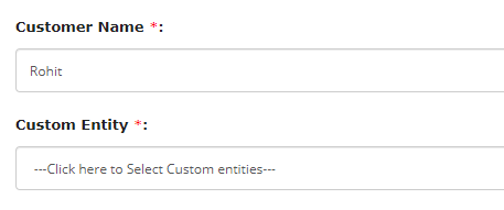 |
|
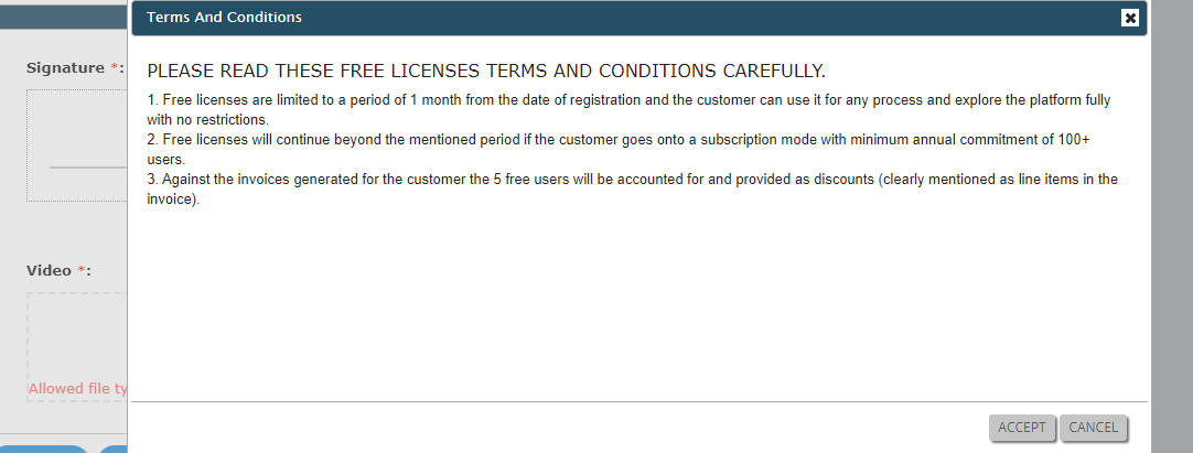
Terms and Conditions |
Signature |
This property allows you to enter terms and conditions to which users must
agree to do the signature. When a user accessing this field, a pop-up will
appear with the terms and conditions entered here. The user must accept them
to do the signature. The below image shows how it works when you access it
from the Web App. |
|
Time Step Value |
Time | The users can be able to select the minutes as per the intervals you defined here. For example, if you set the Time Step Value as 30, then the user will see like 08:30, 09:00, etc. The below image shows how it works when you access it through the Web App.  |
|
Enable Radio Box |
Yes/No | This property allows you to display the options as radio buttons along with the None option. By default, these values will appear as list items. The below image shows how it works when you access it from the Web App.  |
|
Mark as read only |
Yes/No | The user cannot be able to change the value. This option will be helpful if you have defined a default value.  |
|
Default Value |
Yes/No |
This property allows you to select a default value that needs to be displayed while creating work. The users can change the option if needed. |
| Calculate distance by using Google API | Location Diff | This property allows you to calculate the distance between the two selected locations using Google API. |
| Show distance in | Location Diff | This property allows you to select an option to display the distance between two configured locations. You can show the distance in kilometers, meters, or miles. |