
Components of Form Builder
Title
You have to specify the name of the form template with which the users can identify.
The title describes the purpose of the form template to the user who is working with
it. For instance, if you name a form as an Order Booking form, the users can know
that this can be used for booking orders. Look at the below screenshot to know where
to specify the form title.

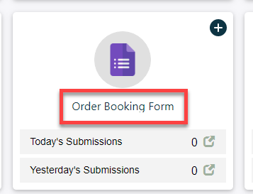
Look at the below screenshot to know how the Title looks when you access the
form through the Web App.
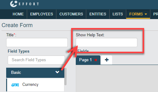
Show Help Text
It is useful if you want to provide the users with additional guidance or
instructions to fill the form. Look at the below screenshot to know where to specify
the help text.
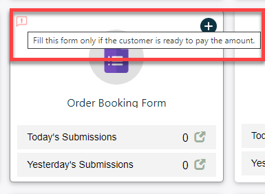
Look at the below screenshot to know how the Help Text looks when you access
the form through the Web App. You need to hover the cursor onto the info icon to see
the help text.
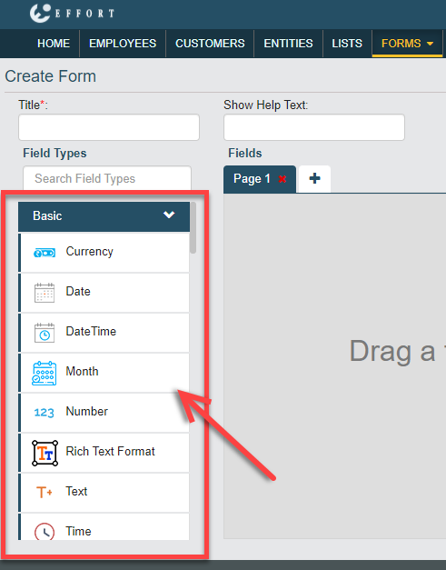
Field Type or Data Type
A field type or data type can be used to capture data. They are used as form fields
and accept entering the data according to its nature. For instance, if you added
number data type into your form, then it accepts entering only numbers. The below
categories of the data types are available to create form.
Look at the below screenshot to know where you can find the data types in the form
builder.
Fields Canvas
The fields canvas is an area where you can drag and drop the required data types to
create a form template. You can create pages, add more fields, and define
customizations. The field must be added to the field canvas to customize the field
and validate the input. Look at the below screenshot to know where you can find the
fields canvas in the form builder.

Refer to the Pages topic to know more about pages.
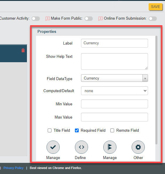
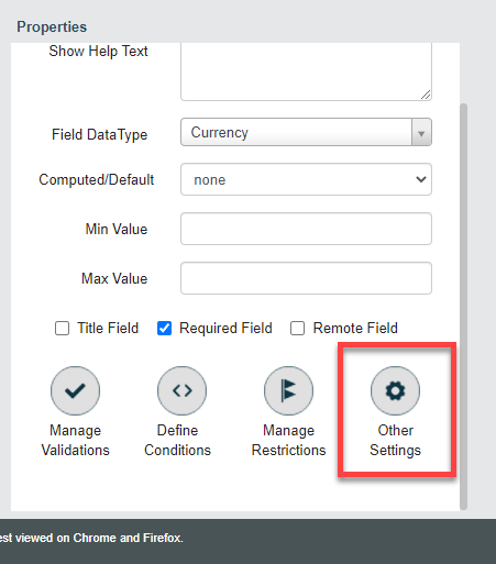
Properties
The properties section allows you to customize the data type that you added to the
fields canvas. You can specify the label, help text, computed/default,
required/optional, etc. Refer to the Field Properties topic to
know more about all the properties applicable for all the data types. Look at the
below screenshot to know where you can find the Properties
section in the form builder.
Additionally, you can define the following:
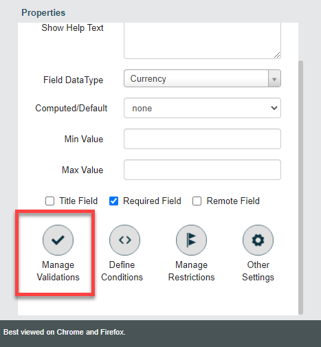
- Manage Validations: You can define conditions to validate the value
entered in the field based on values entered in the current/other form
fields. These settings help you to either show a warning/error message or
highlight the field background when the entered value satisfies the defined
condition. Refer to the Manage Validations topic to know more about all the validations
that you can define for all the data types. Look at the below screenshot to
know where you can find the Manage Validations
section in the form builder.
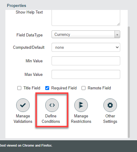
- Define Conditions: You can define conditions to change the functional
behavior of the field. These settings help you to make the field
mandatory/hide/disable based on the values entered in other form fields.
Refer to the Define
Conditions topic to know more about all the conditions that you
can define for all the data types. Look at the below screenshot to know
where you can find the Define Conditions section in
the form builder.
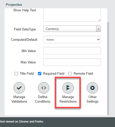
- Manage Restrictions: You can restrict the field visibility and
accessibility only to the particular employee groups. These settings help
you to hide/unhide some sensitive fields to a particular group of people. By
default, the field is accessible to everyone. Refer to the Manage Restrictions
topic to know more about all the restrictions that you can define for all
the data types. Look at the below screenshot to know where you can find the
Manage Restrictions section in the form
builder.
- Other Settings: You can enable the additional features that the field
supports. Also, enables you to customize the field and field value with
various currency types and custom fonts. You can manage the decimal values
to be entered and quickly adjust the values with up-down arrows. Refer to
the Other Settings topic
to know more about all the other settings of all the data types. Look at the
below screenshot to know where you can find the Other
Settings section in the form builder.
Publishing Options
You need to publish any form template after creating it. Publishing makes the form
template available to make form submissions. It enables your employees to access the
form and start submitting forms. You can find different publishing options in the
form builder that enables you to accept form submissions from both internal and
external users. Refer to the Publishing Options
topic to know more about the available publishing options. Once published, any
changes that you make to the form template will be reflected in the published form
automatically. Look at the below screenshot to know where you can find the
Publishing options in the form builder.
