
Field Properties
| Property | Description |
|---|---|
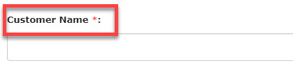
| Label |
The Label field lets the users know what information they have to enter in
the field. It can contain letters from any language, numbers, and special
characters. The below image shows how an entry in the label field looks
like:
 |
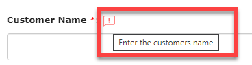
| Show Help Text |
The Show Help Text field allows you to provide some additional information or
instructions to assist the users in entering an appropriate input in the
field. The below image shows how an entry in the label field looks
like:
 |
| Field Data Type |
Shows the currently selected data type of the field. You can also change the data type from the dropdown. |
| Computed/Default |
The value of the field will be automatically populated based on the formula
you provide. You need to define the formula based on the other fields. If
you set the field as Computed, the user cannot be able to change the
populated value. If it is Default, the user can be able to change the
populated value. See below for a sample formula to calculate Total Price
based on Price and Quantity.
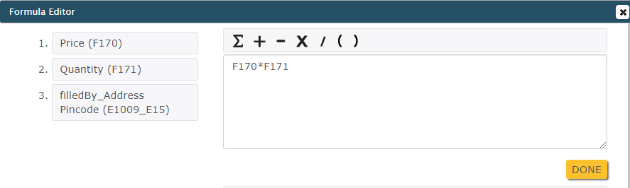 For example, In an Order Form, to calculate the Total Price based on fields
like Price and Quantity, you need to define a formula and see below how it
works.
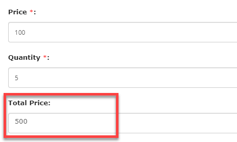 |
| Min Characters |
Note: This Property will be applicable only to the Text data type.
Enter the minimum number of characters that the users will be allowed to enter in the field. The users will be unable to submit the form if the entered characters are below the minimum value. |
| Max Characters |
Note: This Property will be applicable only to the Text data type.
Enter the maximum number of characters that the users will be allowed to enter in the field. The users will be unable to submit the form if the entered characters are above the defined value. |
| Min Value |
Note: This Property will be applicable only to the Number and Currency
data types.
Enter a minimum value that the users will be allowed to enter in the field. The users will be unable to submit the form if the entered value is below the minimum value. |
| Max Value |
Note: This Property will be applicable only to the Number and Currency
data types.
Enter the maximum value that the users will be allowed to enter in the field. The users will be unable to submit the form if the entered value is above the maximum value. |
| Min Digits |
Note: This Property will be applicable only to the Phone data
type.
Enter the minimum number of digits that the users will be allowed to enter in the field. The users will be unable to submit the form if the entered digits are below the specified value. |
| Max Digits |
Note: This Property will be applicable only to the Phone data
type.
Enter the maximum number of digits that the users will be allowed to enter in the field. The users will be unable to submit the form if the entered digits are above the specified value. |
| Form Submission |
Note: This Property will be applicable only to the Form data type.
This field allows you to configure a form to the field. When the users try to select input, the form submissions from the configured form appear in the dropdown. |
| Add Values |
Note: This Property will be applicable only to the Dropdown and Multi Select
Dropdown data types.
This field allows you to enter the values to be displayed in a dropdown menu. |
| List |
Note: This Property will be applicable only to the Pick List and Multi Pick
List data types.
This field allows you to configure a list to the field. When the users try to select input, the items from the configured list appear in the dropdown. |
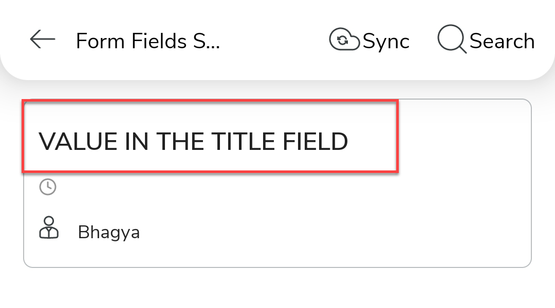
| Title Field |
The value in the Title field becomes an identifier for the form submission in
the mobile app. The users can search their form submissions with the value
entered in the title field. The below image shows how an entry in the Title
field will look like in the mobile app:
 |
| Required Field |
Forces the users to enter an input in the field. Until they enter an input in the field, they will be unable to submit the form. |
| Remote Field |
The value of the field will be fetched from the external systems through API. The other field values are passed to fetch the value. This property works only if the form is an online form. |
| Minimum Entries |
Note: This Property will be applicable only to the Repeatable Section
data type.
Enter the minimum number of entries that the users will be allowed to enter in the field. |
| Maximum Entries |
Note: This Property will be applicable only to the Repeatable Section
data type.
Enter the maximum number of entries that the users will be allowed to enter in the field. |
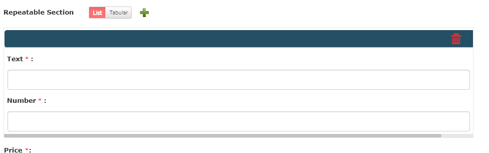
|
Display Style (Web Only) |
Note: This Property will be applicable only to the Repeatable Section
data type and works in the Web App only.
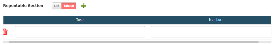
This field allows you to configure the default section view to be visible on the form submission screen. The below image shows how the entries look if you set to List.
 The below image shows how the entries look if you set to Tabular.
 |
| Formulae |
Note: This Property will be applicable only to the Number To Word data
type.
Configure a Number/Currency field from which the value needs to be converted into words. |
| Upload File |
Note: This Property will be applicable only to the Audio (Read Only),
Document (Read Only), Image (Read Only), and Video (Read Only) data
types.
This field allows you to upload a file to be displayed for the users. |
| Upload Thumbnail Image |
Note: This Property will be applicable only to the Audio (Read Only) and
Video (Read Only) data types.
This field allows you to upload a thumbnail for the file to be displayed for the users. |